In the Visual builder, anyone can easily prepare a campaign in a few minutes, even if have no knowledge of HTML coding. The campaign editing menu opens after clicking on the “Edit campaign” button and selecting a template – either an existing one, or one of more than 300 pre-prepared or user-saved templates.
The entire editor in editing mode is divided into 3 parts:
It contains almost all the functionality of the embedded settings for editing emails.
The Settings Panel is divided into 2 parts: Appearance and Content.
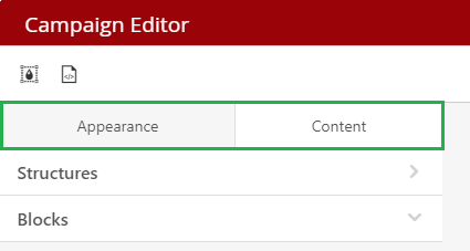
Appearance
Here you can access the following settings:
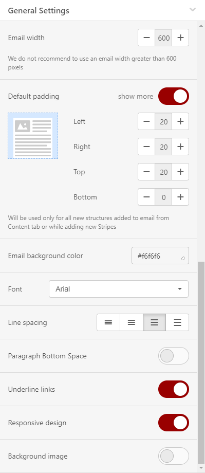
General Settings
Here you can set:
-
Email width – you can set any size between 320 and 900 pixels (default set to 600 px)
-
Default padding – will be used (as default) for all newly inserted structures (content areas) from the Content menu
-
Email background color – enter the HEX color code or select a color from the palette
-
Default font
-
Line spacing – applies by default to all text elements in the email (keep in mind that this is the only way to set the line spacing that will be displayed on mobile devices)
-
enable/disable Links underlining
-
enable/disable Responsive design
-
enable/disable Background image – if the image is set, it is possible to further adjust its repetition and position
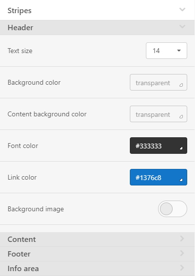
Stripes
A place to define email areas, such as a Header, Content, Footer, or Information area. Here you can set its parameters that will be used for each area by default..
Here (by area) you can set:
- Text size
- Background color
- Content background color
- Font color
- Link color
- Background image
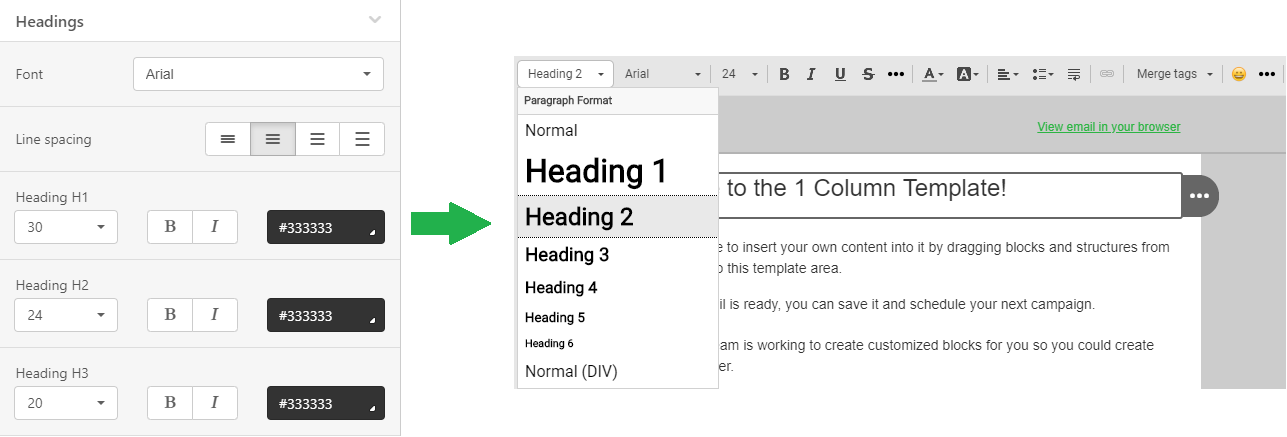
Headings
In this menu you can set the default font, its size, color and other formatting for headers H1, H2, H3.
The menu allows you to set some parameters that will be used for all buttons in the email by default.
Here you can set:
- Highlighting the button after hovering the mouse (the system will offer you a color to highlight, however, it is of course possible to choose a color using the palette or entering the HEX code for the selected (prefered) color)
- Button support in Outlook – allows you to improve their display by inserting special VML code
- Button color
- Highlighted button color (if highlighting is enabled)
- Font - color, font, style and size
- Button border radius (default is 30 pixels)
- Button border (individual or all at once)
- Internal padding

Mobile view
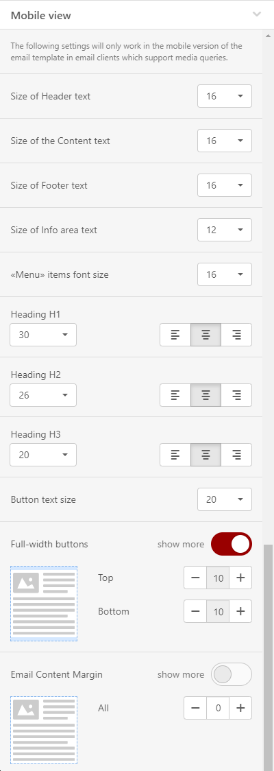
Menu to set how your email will look on mobile devices.
You can set:
- Size of Header text
- Size of Content text
- Size of Footer text
- Size of Info area text
- «Menu» items font size (if the block is used)
- Font size and text alignment for Headings H1, H2, H3
- Button text size
- Full-width buttons padding
- Email Content Margin
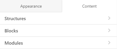
In the Content menu you can add the main elements into your email or template. The elements are Structures, Blocks and Modules.
To create a "skeleton" of a template, simply drag structures with the required number of containers into the template. Then drag and drop content blocks or modules into the containers.
Structures
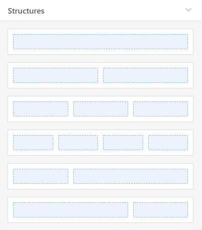
From the menu you can choose a structure that contains 1, 2, 3 or 4 containers.
After placing the structure into the email, you can add additional containers to it. Each structure can contain up to 8 containers.
Blocks
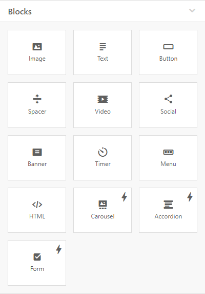
There are currently 13 basic blocks, including an HTML block, that allows you to embed custom code and custom email elements.
More information about Content Blocks can be found here.
Modules
The menu contains previously saved modules that you can reuse and add to your email. You can add your favorite structures, containers, but also entire stripes to the modules, and use them again in the template at any time later.
More information about Modules you can find here.
Elements settings
A drop-down menu with all available settings for the selected email element will appear in the settings panel after clicking on a specific element in the template/email.
Stripes settings
For Stripes, three tables are available in the settings – Appearance, Data and Conditions.
Appearance – to set Stripe background color, Background color of content area, Background image. You can also set the content border and optionally hide the stripe on desktop or mobile device if you don't want it to display on that device.
Below you can specify the structure type – HTML, AMPHTML (Accelerated Mobile Pages) or both.
Data – to set the stripe as a Smart element. More information about Smart elements can be found here.
Conditions – allow the use of conditional blocks, thanks to which you can easily create a rule to determine whether or not a given stripe should be displayed to certain recipients. You can find more information about conditional display of blocks and its settings here.
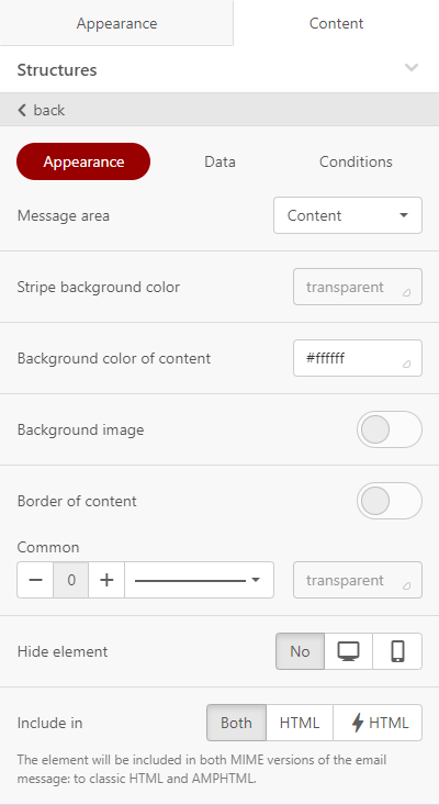
Structures Settings
For structures, three tables are again available in the settings – Appearance, Data and Conditions.
Appearance – here you can add or remove individual containers, adjust the size of containers, set the background color of the structure or the background image of the structure. You can also set the padding of the structure and, if necessary, hide the structure on a desktop device or mobile phone if you don't want it to display on that device.
Below you can specify the structure type again – HTML, AMPHTML or both.
Data – allows you to set the structure as a Smart element. More information about smart elements can be found here.
Conditions – allow the use of conditional blocks, thanks to which you can easily create a rule to determine whether or not a given structure should be displayed to certain recipients. You can find more information about conditional display of blocks and its settings here.

Containers Settings
There are also three tables available for containers in the settings – Appearance, Data and Conditions.
Data – allows you to set the container as a Smart element. More information about smart elements can be found here.
Appearance – here you can set the background color of the container or the background image. You can also set the padding of the container or rounding. You can hide the container on a desktop device or mobile phone if you don’t want it to display on that device.
Conditions – allow the use of conditional blocks, thanks to which you can easily create a rule to determine whether or not a given container should be displayed to certain recipients. You can find more information about conditional display of blocks and its settings here.
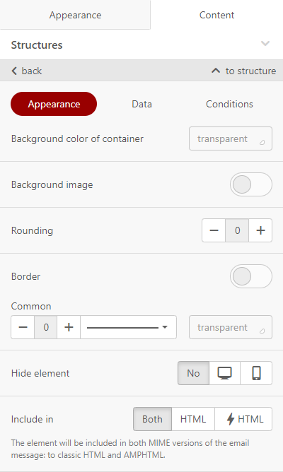
Content Block settings
The block settings depend on the block type. You can find more about setting up and working with content blocks here.
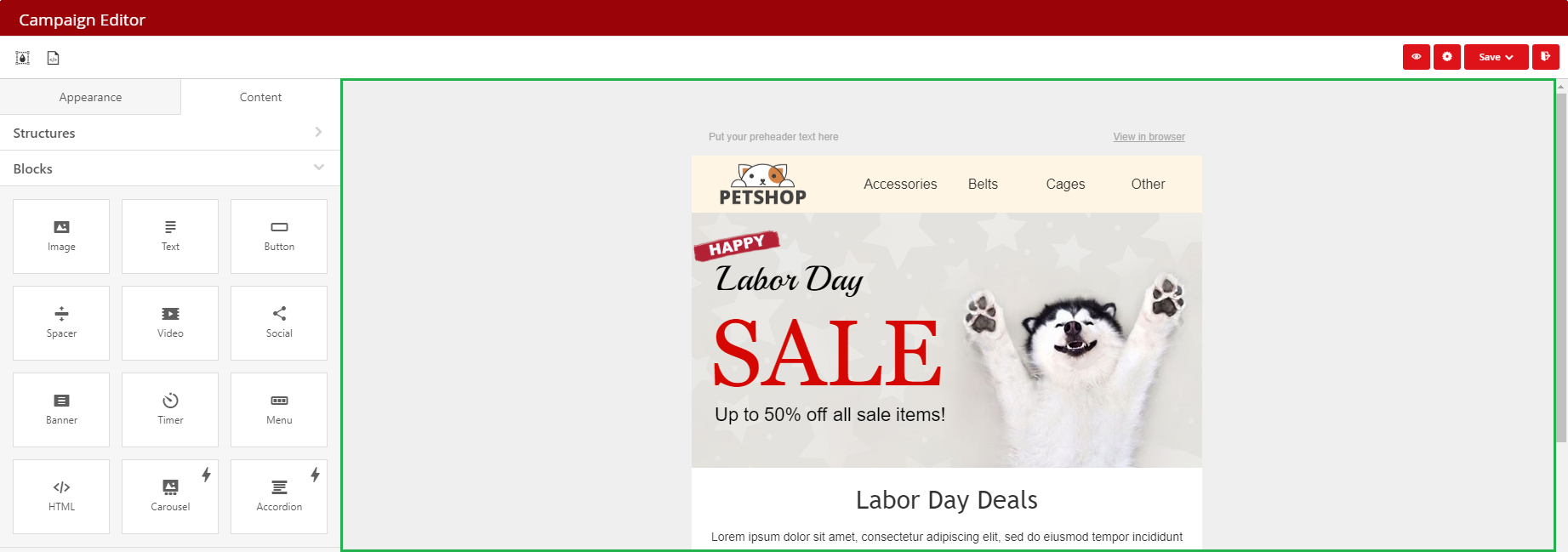
You can drag and drop individual content blocks, structures or modules from the left panel to the email/template editing area.
You can set the required number of Stripes and their type.
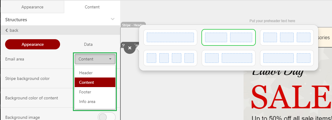
Use the drop-down menu to delete, copy, move, or save any email element as module.

You can select any element by clicking on it. Once selected, you will see the settings for that particular element in the left panel.
Each Stripe can contain an unlimited number of other elements.
Each Structure can contain 1 to 8 containers.
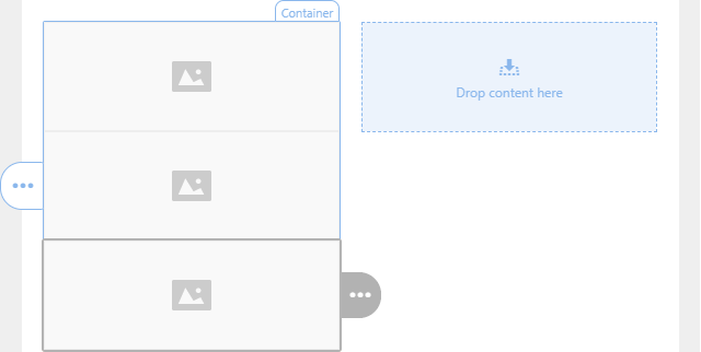
Containers can contain an unlimited number of other elements if you place them one under another. But if you want to place the element to the right or left, you will need to use different containers.


