Email Template Design
Plenty of attention has been given to templates which will encourage people to subscribe to your email list. As subscriber numbers rise, we marketers pat ourselves on the back - and rightly so. But this isn’t a fait accompli. The endgame for many brands isn’t subscriber increase - it’s ultimate loyalty. And that takes a lot of nurturing.
For our starting point, let’s assume that you’ve already got a subscriber list. Your ‘Awareness’ templates have worked - well done. Now you’ve got to create templates which will guide your subscribers through the rest of their customer journey. Really, the true work of marketing is just beginning.
You may not need to send an email at every stage of your leads’ journeys. In fact, discretion is often the better part of valour. Too much mail traffic from you can feel overwhelming and is more likely to irritate than engage your customers. So do your research on your audience and their journeys before selecting a few touch points to create templates for. With that caveat, however, let’s dive into the funnel and check out some template examples.
Consideration
Your lead has signed up to your emails. They’re intrigued by what you do, and they want to learn more. But you’re probably not the only brand they’re researching. It’s likely that they’ve also signed up to receive emails from your competitors. So, how can you bring their attention fully over to your side?
At this stage, you’re not pushing for sales. Your templates should work on increasing familiarity with your brand and what you do. They’re considering a problem that is bothering them. They’re researching those solutions. What someone doing research wants most of all is information. So, give them that information.
A great way to share information is to organize a webinar and invite the subscribers to be a part of it.
Here’s an example by Email on Acid:
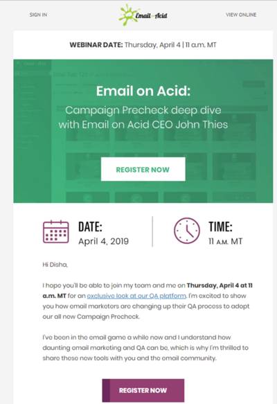
Communicate with them on the level, sharing your knowledge on the area you’re both interested in. Templates which contain space for informative content are great at this stage. They’ll mark you out as an expert in your field, without being overly pushy. Include CTAs by all means, but keep them unobtrusive.
Once you’ve shared your know-how, established your credentials, and built up some familiarity, you’ll find yourselves progressing to...
Intent
Fully armed with knowledge, the prospect now knows that they really do need to find a solution to their problem. But should it be the solution you’re offering? If you’ve done the groundwork at the consideration stage and made them familiar with your product/services, then you’re in with a good shot. But the deal is not in the bag yet.
At the intent stage, the customer will be evaluating their options - one of which may well be the one you’re offering. So, how do you narrow their focus into your brand?
Now’s the time to introduce your USPs. If you offer free shipping, make that a prominent point in your Intent templates.
If you’re local, or highly reviewed, or can do something that your competitors can’t, let your prospect know.
Templates at this stage will probably look the most ‘markety’. Intent templates aren’t about information or building rapport (although it won’t hurt to keep the tone friendly!). They’re about establishing yourself as the very best option for your customer. Think about promotion templates. If you can, create a stock of personalised templates which relate to your customer’s interactions. For example, if they peruse a product on your website, this is the stage to send out the ‘Come back and check out this product again!’ template. If anything they’ve shown an interest in goes on sale, this should also trigger an email.
Coursera offers 30% off to entice the subscribers to decide and make a purchase:
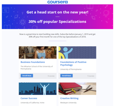
Some customers may almost convert at the intent stage, but then back out at the last minute. A common example of this is cart abandonment. If this happens, you need to first work out why, and then create a template encouraging them to seal the deal. We’re all familiar with the cart-abandonment template (“Come back and buy your items!”) - the trick here is to make it seem like a friendly nudge rather than a cry to “BUY MY STUFF!”
It is recommended that you have a cart abandonment series of two to three emails rather than a single email.
ASICS sends out two emails in their cart abandonment series to recover the lost customers:
Game apps have this kind of nudge down to a tee - “Your characters miss you!” is a common style of email used when a gamer hasn’t been playing in a while. Tugs on the heartstrings, reminds them what they’re missing, and often leads to conversion. Speaking of which...
Conversion
Again, conversion is absolutely not the be-all-and end all. This is just the start of what will hopefully be a great repeating relationship. If someone’s converted into a paying customer, let them know how thankful you are.
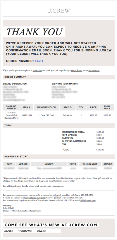
A simple and effective template is the “Thank you for your order” template. We’ve all received these. They may seem ubiquitous, but they serve a greater purpose than you may think. For a start, they let the customer know that you’ve got their order and are processing it. This assures the customer that their order is in good hands. Secondly, it demonstrates that all-important gratitude for their custom. And, thirdly, it gives the customer valuable information about their order, including cost, shipping date estimates and so on.
J.Crew sends a nice transactional email to express their gratitude and inform the subscriber about the order confirmation:
If you want to really seal the deal, you can line up a template to send out when the order has shipped (or the service will be completed), or any other updates you feel could be helpful to the customer.
Loyalty
No, the journey is still not over! The customer journey never actually ends, FYI. You’ve grabbed their attention, nurtured their interest and converted them into a paying customer. Great stuff! Now it’s time to do it all again. This time, you have a big advantage, however: the customer has now sampled your stuff and (hopefully) knows that you’re good at what you do. If you get the next round of templates right, your customer won’t only repeat their business - they may also recommend you to their friends.
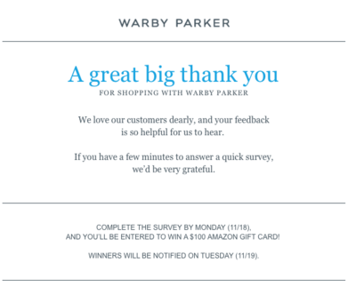
Your post-purchase templates should therefore focus on building a relationship. How can you do this? Well, you could ask them for feedback, or to share their experiences.
Here’s how Warby Parker does it. They even offer an incentive to the subscribers who complete the survey by a specific timeline to encourage immediate action:
You could ask them to sign up to your newsletter. You could simply check in with them on a one-to-one level, to ensure that they liked what you provided.
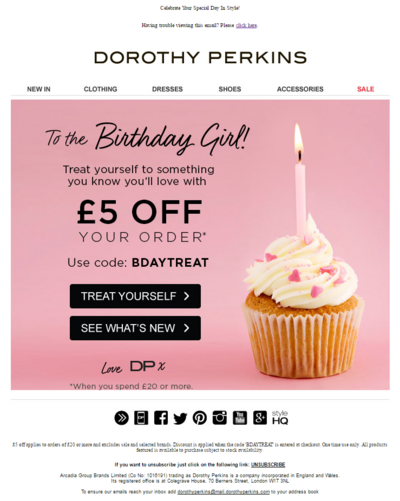
Building a relationship is all about remembering things about one another, so your data collection tools will be crucial here. Create templates which will periodically let your customer know about things which may interest them, or update them on what you’re up to. If they’ve let you know their birthday or other special dates, a “Happy birthday” template won’t go amiss (especially if it contains special birthday offers).
Dorothy Perkins makes the subscriber’s birthday even more special by wishing her with a cupcake and gifting a discount as the birthday treat:
All in all, keep in touch, and keep your brand relevant to your customer.
Of course, you can’t just make up these templates on the hoof. They need to be ready to go, after a quick sprinkle of personalisation. And to do that properly, you need to know the kind of template your customer will be receptive to, and when. So, be sure to keep digging into your data, getting to know your customers, analysing their responses, and tweaking your templates accordingly.


